Scaling a Multi-Brand Design System
Designing a semantic token architecture to balance scalability, accessibility, and visual identity across white-label products.

Platform
White-label Mobile Applications
My Role
Product Designer
Duration
2 months
Team
Design + Engineering
Challenge
The goal wasn't simply to implement Dark Mode: it was to redesign the entire color architecture of the Design System to support multiple white-label brands in a scalable way.
Key challenges
Eliminate hardcoded colors from components.
Decouple brand identity from the system architecture.
Support Light and Dark Mode across multiple brands without creating brand-specific exceptions.
Maintain visual consistency and accessibility.
Results
• Migrated 100% of the Design System library to Figma Variables.
• Created independent Light and Dark themes for each white-label brand.
• Documented the architecture for Design and Engineering teams.
• Established a scalable foundation for future Design System evolution and faster brand adaptation.
100+
Components migrated to tokens
80+
Colour variables mapped across themes
Weeks → Days
Brand adaptation reduced

Design System Audit
Before starting the migration, I audited the Design System to understand how colors were being used throughout the product.
HEX values applied directly inside components.
Limited reuse across products.
Brand identity tightly coupled to UI components.
No architecture prepared to support multiple themes.
Process
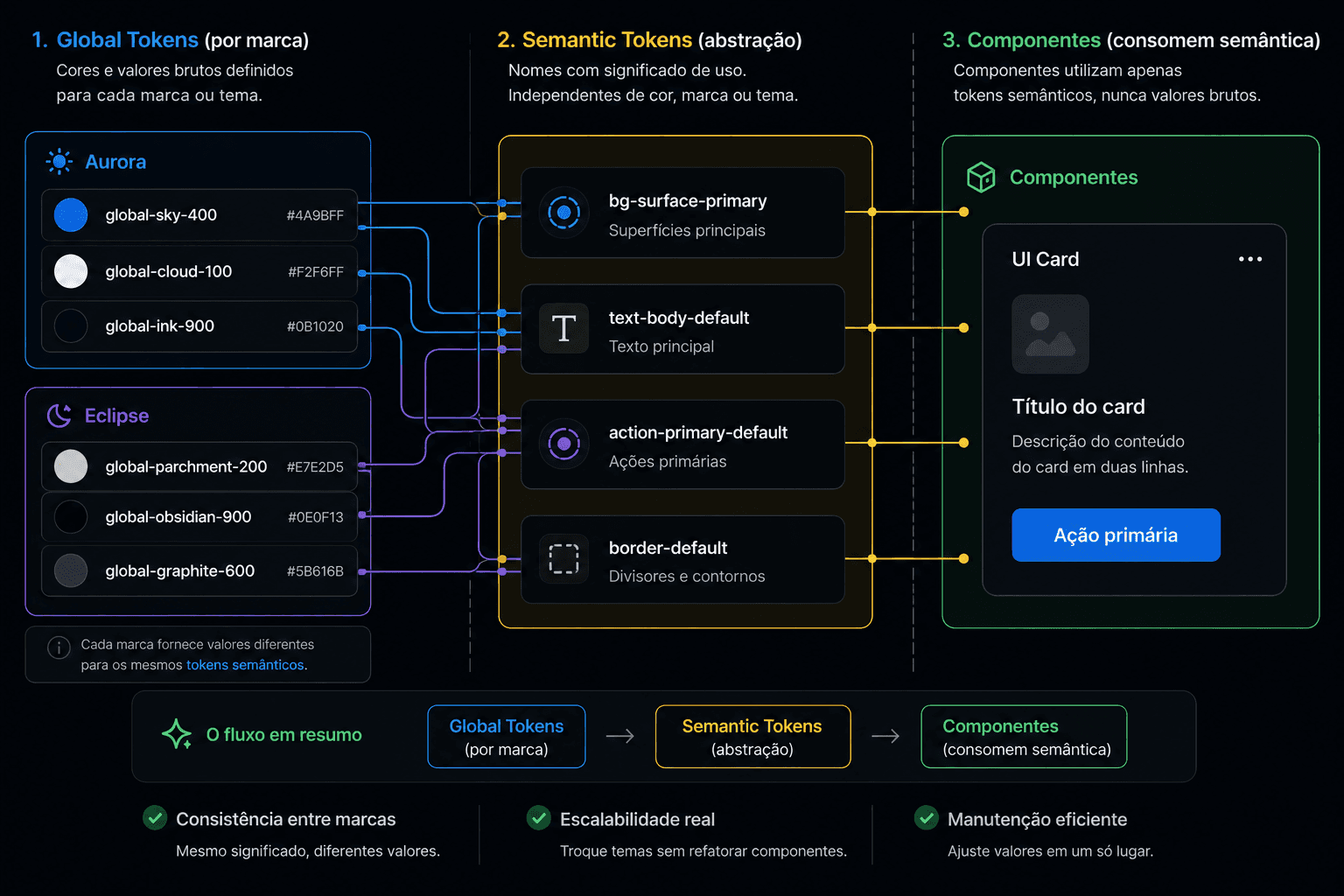
Instead of creating a parallel version of the Design System for Dark Mode, I restructured the entire color architecture following Design Token principles.
The system was divided into two abstraction layers.
Primitive Tokens
• Tonal scales (Blue 50, Blue 100... Blue 900).
Semantic Tokens
• Usage intent (such as bg-surface-primary, text-secondary, and border-default).
This allowed components to reference only semantic meaning rather than specific color values.

Tokenizing the Entire Library:
After defining the architecture, I manually migrated the entire Design System to Figma Variables, updating every component individually.
Backgrounds, text, icons, borders, states, and overlays were all migrated to consume semantic tokens exclusively.
Design System Audit
Before starting the migration, I audited the Design System to understand how colors were being used throughout the product.
HEX values applied directly inside components.
Limited reuse across products.
Brand identity tightly coupled to UI components.
No architecture prepared to support multiple themes.
Process
Instead of creating a parallel version of the Design System for Dark Mode, I restructured the entire color architecture following Design Token principles.
The system was divided into two abstraction layers.
Primitive Tokens
• Tonal scales (Blue 50, Blue 100... Blue 900).
Semantic Tokens
• Usage intent (such as bg-surface-primary, text-secondary, and border-default).
This allowed components to reference only semantic meaning rather than specific color values.

Tokenizing the Entire Library:
After defining the architecture, I manually migrated the entire Design System to Figma Variables, updating every component individually.
Backgrounds, text, icons, borders, states, and overlays were all migrated to consume semantic tokens exclusively.
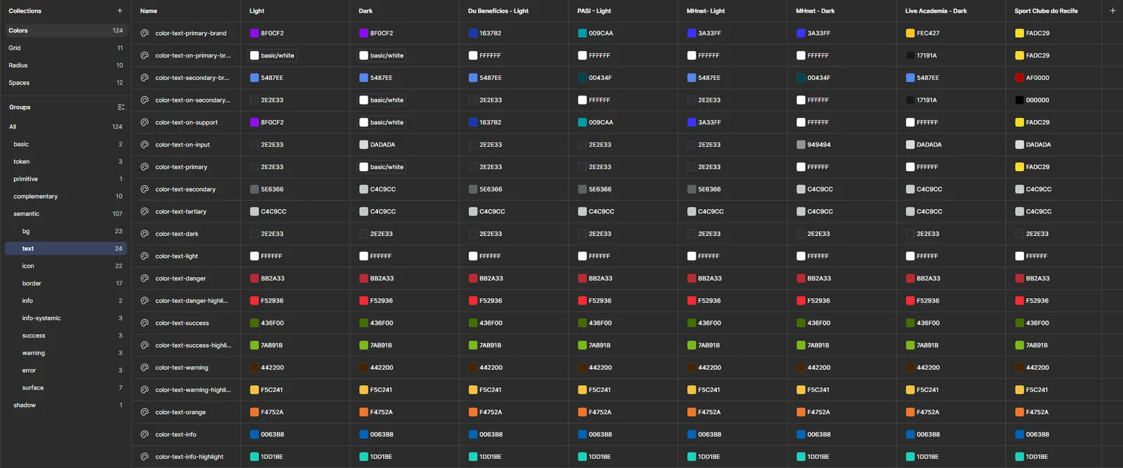
The architecture was then organized into independent themes for each brand.
As a result, the same components could be reused across products, while only the underlying token values changed based on the active theme.
Brand identity became the responsibility of the theme, not the components.

Stress Testing the Architecture
The architecture worked well for brands with more neutral color palettes but revealed limitations when applied to highly saturated brand identities.
Solution: Rather than introducing brand-specific exceptions, semantic tokens were mapped to different tonal values within the same color scale based on the active theme.

Accessibility
The entire architecture was validated using Figma's built-in contrast checking tools.
This ensured that both Light and Dark themes met appropriate accessibility standards before handoff to Engineering.

Trade-offs & Handoff
Building a multi-brand Design System required balancing scalability, implementation simplicity, and consistency between Design and Engineering.
Architectural decisions:
• Adopt semantic tokens instead of brand-specific exceptions.
• Decouple components from brand identity using Figma Variables.
Create independent Light and Dark themes for every brand.
Use tonal scales to preserve contrast for highly saturated brands.
Document architectural limitations rather than solving them with one-off workarounds.
Handoff:
To streamline Engineering adoption, I delivered:
Design Token architecture documentation.
Organized Variables and Themes in Figma.
Light & Dark Mode implementation guidelines.
Component and token usage documentation.
Technical references for future Design System evolution.
Key Learnings
• Semantic clarity is more important than visual precision when designing scalable systems.
Components should only understand the purpose of a color, never its actual value.
White-label products require a clear separation between brand identity and Design System architecture.
Architectural limitations should be documented rather than addressed with one-off workarounds.
Dark Mode evolved from a visual feature into a structural transformation of the Design System, establishing a reusable foundation capable of supporting multiple products, brands, and future platform evolution.
Acessibilidade
Toda a arquitetura foi validada utilizando as ferramentas de contraste do próprio Figma.
Esse processo garantiu que Light e Dark Mode mantivessem níveis adequados de contraste antes do handoff para Engenharia.
Trade-offs e Handoff
Projetar um Design System multi-brand exigiu equilibrar escalabilidade, simplicidade de implementação e consistência entre Design e Engenharia.
Decisões arquitetônicas:
Priorizei tokens semânticos em vez de exceções específicas por marca
Desacoplei os componentes da identidade visual utilizando Variáveis do Figma
Estruturei temas independentes para Light e Dark Mode de cada marca
Adotei escalas tonais para preservar contraste em identidades altamente saturadas
Documentei limitações estruturais em vez de criar soluções ad hoc
Entrega para Engenharia:
Para garantir adoção consistente, o handoff incluiu:
Arquitetura de Design Tokens documentada
Organização das Variáveis e temas no Figma
Diretrizes de implementação de Light & Dark Mode
Regras de uso dos componentes e tokens
Referência técnica para evolução do Design System
Este projeto mostrou que Dark Mode não é um problema de interface, mas de arquitetura.
Os principais aprendizados foram:
Clareza semântica supera precisão visual em sistemas escaláveis
Componentes não devem conhecer valores de cor, apenas intenção de uso
Sistemas white-label exigem desacoplamento entre identidade visual e interface
Limitações arquitetônicas devem ser documentadas, não contornadas
O valor de um Design System está na capacidade de evoluir sem aumentar sua complexidade
O Dark Mode deixou de ser uma feature visual e passou a representar uma transformação estrutural na arquitetura do Design System, estabelecendo uma base reutilizável para múltiplos produtos, marcas e futuras evoluções da plataforma.
Com a arquitetura pronta, estruturei diferentes modos de Variáveis para cada marca.
Exemplos:
PASI • Light
PASI • Dark
MHNET • Light
MHNET • Dark
Essa abordagem permitiu reutilizar exatamente os mesmos componentes enquanto apenas o tema alterava os valores dos tokens.
A identidade visual passou a ser responsabilidade do tema, não dos componentes.A identidade visual passou a ser responsabilidade do tema, não dos componentes.
Scaling a Multi-Brand Design System
Designing a semantic token architecture to balance scalability, accessibility, and visual identity across white-label products.
Platform:
White-label Mobile Applications
My Role
Product Designer
Duration
2 months
Team
Design + Engineering
Challenge
The goal wasn't simply to implement Dark Mode: it was to redesign the entire color architecture of the Design System to support multiple white-label brands in a scalable way.
Key challenges:
Eliminate hardcoded colors from components.
Decouple brand identity from the system architecture.
Support Light and Dark Mode across multiple brands without creating brand-specific exceptions.
Maintain visual consistency and accessibility.
The goal wasn't simply to implement Dark Mode: it was to redesign the entire color architecture of the Design System to support multiple white-label brands in a scalable way.
Key challenges
Eliminate hardcoded colors from components.
Decouple brand identity from the system architecture.
Support Light and Dark Mode across multiple brands without creating brand-specific exceptions.
Maintain visual consistency and accessibility.
Results
• Migrated 100% of the Design System library to Figma Variables.
• Created independent Light and Dark themes for each white-label brand.
• Documented the architecture for Design and Engineering teams.
• Established a scalable foundation for future Design System evolution and faster brand adaptation.
100+
Components migrated to tokens
80+
Colour variables mapped across themes
Weeks → Days
Brand adaptation reduced
Design System Audit
Before starting the migration, I audited the Design System to understand how colors were being used throughout the product.
Key findings:
HEX values applied directly inside components.
Limited reuse across products.
Brand identity tightly coupled to UI components.
No architecture prepared to support multiple themes.
Before starting the migration, I audited the Design System to understand how colors were being used throughout the product.
HEX values applied directly inside components.
Limited reuse across products.
Brand identity tightly coupled to UI components.
No architecture prepared to support multiple themes.
Process
Instead of creating a parallel version of the Design System for Dark Mode, I restructured the entire color architecture following Design Token principles.
The system was divided into two abstraction layers.
Primitive Tokens
• Tonal scales (Blue 50, Blue 100... Blue 900).
Semantic Tokens
• Usage intent (such as bg-surface-primary, text-secondary, and border-default).
This allowed components to reference only semantic meaning rather than specific color values.
Tokenizing the Entire Library:
After defining the architecture, I manually migrated the entire Design System to Figma Variables, updating every component individually.
Backgrounds, text, icons, borders, states, and overlays were all migrated to consume semantic tokens exclusively.
The architecture was then organized into independent themes for each brand.
As a result, the same components could be reused across products, while only the underlying token values changed based on the active theme.
Brand identity became the responsibility of the theme, not the components.
Stress Testing the Architecture
The architecture worked well for brands with more neutral color palettes but revealed limitations when applied to highly saturated brand identities.
Solution: Rather than introducing brand-specific exceptions, semantic tokens were mapped to different tonal values within the same color scale based on the active theme.
This preserved visual hierarchy, accessibility, and brand identity without increasing the system's complexity.
Stress Testing the Architecture
The architecture worked well for brands with more neutral color palettes but revealed limitations when applied to highly saturated brand identities.
Solution: Rather than introducing brand-specific exceptions, semantic tokens were mapped to different tonal values within the same color scale based on the active theme.
Accessibility
The entire architecture was validated using Figma's built-in contrast checking tools.
This ensured that both Light and Dark themes met appropriate accessibility standards before handoff to Engineering.
Trade-offs & Handoff
Architectural decisions:
• Adopt semantic tokens instead of brand-specific exceptions.
Decouple components from brand identity using Figma Variables.
Create independent Light and Dark themes for every brand.
Use tonal scales to preserve contrast for highly saturated brands.
Document architectural limitations rather than solving them with one-off workarounds.
Handoff:
To streamline Engineering adoption, I delivered:
Design Token architecture documentation.
Organized Variables and Themes in Figma.
Light & Dark Mode implementation guidelines.
Component and token usage documentation.
Technical references for future Design System evolution.
Key Learnings
• Semantic clarity is more important than visual precision when designing scalable systems.
Components should only understand the purpose of a color, never its actual value.
White-label products require a clear separation between brand identity and Design System architecture.
Architectural limitations should be documented rather than addressed with one-off workarounds.
Dark Mode evolved from a visual feature into a structural transformation of the Design System, establishing a reusable foundation capable of supporting multiple products, brands, and future platform evolution.